Resolution → aspect, class name, PPI, raw size (image + video)
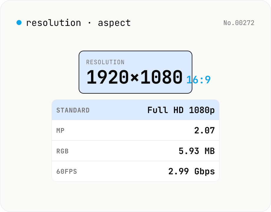
Type a pixel resolution like `1920x1080` and see **GCD-reduced aspect ratio (16:9)**, **standard name (Full HD / 4K UHD / TikTok / iPhone — 25 presets)**, **megapixels**, **uncompressed RGB memory footprint**, **bandwidth for 60 fps raw video (Gbps)**, and **PPI when you specify a diagonal**. Useful for picking export resolutions, sanity-checking UI mocks, estimating raw asset sizes, and verifying mobile/desktop compatibility. Accepts separators `x`, `×`, `*`, `,`, or whitespace.
How to use
Enter a **pixel resolution** like `1920x1080`, `3840×2160`, `1080,1920`, or `2560 1440` (separators `x`, `×`, `*`, `,`, or whitespace all work) and the tool reports the **GCD-reduced aspect ratio** (16:9), the **closest standard** (Full HD, 4K UHD, TikTok, iPhone 15 Pro — 25 presets), **megapixels**, **total pixel count**, **uncompressed RGB / RGBA memory footprint**, and **bandwidth for raw 60 fps video**. Add a **diagonal size in inches** to compute **PPI**. All 25 reference standards are listed below so you can scan them.
In depth
Screen resolution as a device fingerprinting signal
Screen resolution is one of the primary signals used in browser fingerprinting. The combination of screen.width, screen.height, and device pixel ratio, joined with User-Agent, OS, and timezone, can identify a specific device within a large population with high accuracy. Unusual resolutions — DCI 4K at 4096×2160, non-standard HiDPI configurations, or ultra-wide variants — have especially high discriminative power.
Online resolution tools sometimes auto-collect the visiting browser’s resolution and report it to analytics alongside other device characteristics. Accessing a tool to ‘check my resolution’ can itself be a fingerprinting event. This tool does only the arithmetic you request and collects nothing.
What online resolution calculators sometimes collect
Many resolution and aspect-ratio calculators run advertising models that inject multiple analytics scripts. Some capture screen.width, screen.height, devicePixelRatio, and viewport size automatically on page load and send them to third-party measurement endpoints before the user has typed anything. The act of visiting the page to look up a resolution becomes a data-sharing event.
This tool performs only the calculations you explicitly request. Entered resolution values stay in page memory and are never transmitted. The reference dictionary of 25 standard resolutions is bundled statically.
Pure browser arithmetic for GCD, PPI, memory, and bandwidth
Aspect ratio reduction uses the Euclidean GCD algorithm. Nearest-standard matching ranks entries within 5% aspect tolerance by log2 distance. Megapixel count, uncompressed RGB/RGBA memory footprint (pixels × 3 or 4 bytes), and 60-fps raw bandwidth (pixels × 3 bytes × 8 bits × 60) are integer or floating-point multiplications. PPI is the Pythagorean diagonal in pixels divided by the entered diagonal in inches. All computations run entirely in browser JavaScript with no external API calls.
The 25 standard-resolution dictionary is compiled into the bundle at build time. Entering a production spec, an unreleased device target, or an internal broadcast resolution yields results without any of those numbers leaving the device.
Pre-production checks for video encoding, design, and display
Before selecting an encoder profile for a 4K video project, check the raw uncompressed bandwidth to confirm the pipeline can handle it. Before creating a design mockup artboard, verify that your intended resolution maps to a named standard and confirm the aspect ratio is what the platform expects. Before shipping a HiDPI asset, calculate the PPI at the target screen size to verify Retina threshold (roughly 200 PPI at typical viewing distance). These checks take seconds locally and avoid the slower feedback loop of discovering issues in production.
Euclidean GCD, PPI calculation, and raw bandwidth formulas
Aspect ratio reduction uses the Euclidean algorithm: while (b) { [a, b] = [b, a % b]; } return a; — O(log min(a, b)) and one line in JavaScript. Dividing both dimensions by the GCD gives the smallest integer ratio: 1920×1080 reduces to 16:9 via GCD 120. One caveat is that some marketed resolutions round oddly: 1366×768 reduces to 683:384 via GCD 2 even though it is colloquially “16:9”, because 1366 is a rounded-up approximation of 1365.33. The tool’s standard-name matcher therefore uses a ±5% aspect tolerance and picks the closest reference entry by log2 distance, so common near-16:9 resolutions still surface a recognisable name.
PPI (pixels per inch) is the diagonal pixel count divided by the diagonal in inches: diagonalPixels = sqrt(w^2 + h^2); PPI = diagonalPixels / diagonalInches. iPhone 15 Pro at 2556×1179 on a 6.1-inch diagonal works out to roughly 461 PPI. Apple’s “Retina threshold” depends on viewing distance: about 326 PPI for a phone held at 12 inches, 220 PPI for a Mac at 20 inches, 60 PPI for a TV at 80 inches — the angular pixel density at which individual pixels become indistinguishable. The raw 60-fps RGB video bandwidth is width × height × 3 bytes × 8 bits × 60 = width × height × 1440 bps. 4K UHD comes to roughly 12 Gbps, comfortable on HDMI 2.1 (48 Gbps) but requiring 4:2:0 chroma subsampling on HDMI 2.0 (18 Gbps).
Resolution naming history and the inconsistencies it produced
“4K” refers to two distinct standards: cinema DCI 4K (4096×2160, SMPTE 2048-2) at a 1.90 aspect ratio, and consumer 4K UHD (3840×2160, ITU-R BT.2020) at 1.78. The roughly 6 % aspect mismatch means pillarbox or letterbox bars when one is shown on the other. The “8K” name has the same split: DCI 8K (8192×4320) versus UHD-2 (7680×4320). On phones, the suffix + (FHD+, QHD+) indicates a taller-than-16:9 aspect (19.5:9 or 20:9) but is not industry-standard — Samsung’s FHD+ is 2280×1080, Google Pixel’s FHD+ is 2400×1080, so the label alone is not enough.
The CRT-era VGA/SVGA/XGA/SXGA/UXGA/QXGA family, the wide-screen W-prefixed family (WXGA, WSXGA+, WUXGA, WQHD), and the TV-derived HD/FHD/QHD/UHD family all coexist, so the same resolution often has multiple names — 2560×1440 is WQHD, QHD, and 1440p simultaneously. The 25 entries bundled in this tool cover the main video standards plus mobile-first formats (TikTok 1080×1920, Instagram 1080×1080, iPhone tall aspects, iPad, Apple Watch). Another common source of confusion is the gap between physical pixel resolution and CSS logical resolution: a Retina Mac may report screen.width as 1440 while the panel is 2880 pixels wide, because devicePixelRatio is 2. Calculations that mix the two yield results that look “off by 2x”. When the input is an actual image file rather than a numeric resolution, image-aspect-find inspects each file’s intrinsic width / height, and screen-size-calc helps work backward from a target physical diagonal so the PPI numbers above land on the right reference distance.
FAQ
- Is my input uploaded?
- No — pure browser arithmetic, no external API.
- How is the closest standard chosen?
- **1. Exact match** when the input matches an entry verbatim (1920x1080 → Full HD). **2. Approximate match** otherwise — entries within 5% aspect tolerance are ranked by **log2 distance** (`log2(w/sw)² + log2(h/sh)²`), and the smallest wins. Standards with a very different aspect (16:9 vs 21:9) are eliminated first.
- What's PPI?
- **PPI = Pixels Per Inch**, computed as `PPI = √(w² + h²) / diagonal-inches`. A 27-inch 4K monitor sits around **163 PPI**; high-end phones reach **400-500 PPI**. Apple labels a display 'Retina' once it hits ~200 PPI at normal viewing distance.
- What does 'uncompressed RGB memory' mean?
- **Pixel count × 3 bytes** (one byte each for R / G / B at 8-bit depth). 1080p ≈ 6 MB, 4K UHD ≈ 24 MB, 8K UHD ≈ 96 MB. This is the in-memory footprint, not the on-disk size of a PNG / JPG. RGBA adds an alpha byte for 4 bytes per pixel.
- What does '60 fps raw bandwidth' mean?
- **Pixel count × 3 bytes × 8 bits × 60 fps**. 1080p is ~3 Gbps, 4K is ~12 Gbps, 8K is ~48 Gbps. **HDMI 2.0 caps at ~18 Gbps**, **HDMI 2.1 at ~48 Gbps** — so 4K @ 60 fps fits 2.0 and 8K @ 60 fps just fits 2.1. Real-world video shrinks this by 100× via subsampling (4:2:0) and compression (HEVC / AV1).
- Vertical resolutions like 1080×1920?
- Orientation (landscape / portrait / square) is reported, and the aspect stays in w:h form (1080:1920 → 9:16). Portrait standards like TikTok and the iPhone family are included so vertical matches work correctly.
- DCI 4K vs UHD 4K?
- **UHD 4K** is 3840×2160 (16:9) — TV / monitor standard. **DCI 4K** is 4096×2160 (~17:9) — digital cinema. Distribution masters often crop down to 1.85:1 or 2.35:1, but the container is 4096 wide. The tool lists both so they don't collapse into one.
- What if my resolution isn't in the list?
- It picks the closest entry within 5% aspect tolerance using log2 distance — 1280×800 (16:10) for example will land on WXGA+ (1440×900) if that's closer than the others. Wildly different aspects (16:9 vs 4:3) won't produce a misleading match.
- Is there an upper limit?
- Yes — width and height are capped at **100,000 px each**, well beyond 16K (15360×8640), to keep the UI from breaking on pathological inputs.
How to verify nothing is uploaded
This tool never sends your input outside your browser. The pages below explain how it works, how to audit it, and how the site is run.
Related tools
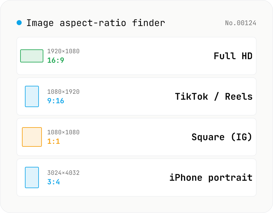
Image aspect-ratio finder — GCD ratios + 1080p / 4K / iPhone / TikTok match
Drop multiple images and see each one's width × height, the GCD-reduced aspect ratio (1920×1080 → 16:9, 3024×4032 → 3:4) and the closest matching standard format (Full HD 1080p, 4K UHD, iPhone screen sizes, TikTok 9:16, Instagram 4:5, YouTube thumbnail 1280×720 — 30+ presets). Useful for web design / marketing workflows: confirm a single asset fits Instagram + YouTube + TikTok, check whether a 21:9 hero shot matches your device targets, or sanity-check that an asset set is all the same aspect. The comparison table makes it easy to spot odd ones out. Everything runs in your browser (uses `Image()` `naturalWidth/Height`); images are never uploaded.
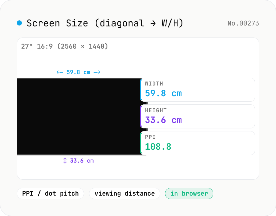
Screen Size Calculator (diagonal → width / height + PPI)
From a diagonal inch and aspect ratio (16:9 / 21:9 / 32:9 / 4:3 / custom), compute actual width and height in cm and inches, plus screen area. Add a resolution (e.g. 3840×2160) to get PPI (pixels per inch) and dot pitch. Suggested viewing distances per UHD / THX / SMPTE guidelines round it out — handy for picking monitors, TVs, and phones.
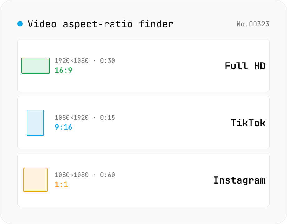
Video aspect-ratio finder — resolution + duration + GCD ratio + 1080p / TikTok match
Drop video files and see each one's resolution (width × height), duration, GCD-reduced aspect ratio (1920×1080 → 16:9, 1080×1920 → 9:16) and the closest matching standard format (Full HD 1080p, 4K UHD, TikTok 9:16, Instagram 4:5, YouTube 16:9, Cinemascope 21:9 — 17 presets). The **video counterpart to `image-aspect-find`** — quickly check whether assets need resizing for social, whether your asset set mixes portrait and landscape, or whether everything matches your timeline's sequence settings. Codec / bitrate / fps deep-dive belongs to `video-codec-info`; this tool focuses on **aspect, resolution and duration only**, so it stays lightweight (uses `HTMLVideoElement` metadata, no wasm). Perfect for pre-publishing checks across Instagram + TikTok + YouTube. CSV export supported. Everything runs in your browser — videos are never uploaded.
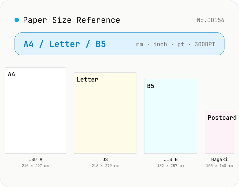
Paper Size Reference
Look up paper sizes (A4 / B5 / Letter / Legal / postcard / business card / envelopes) with millimetres, centimetres, inches, points, and pixel dimensions at 72 / 96 / 150 / 300 / 600 DPI. Distinguishes ISO 216 (A / B / C series) from JIS B; includes Japanese photo formats (L / 2L / KG) and postal envelope standards. Search across names, aliases, and notes with a series filter. Useful for print, DTP, PDF export, and image sizing decisions.