Screen Size Calculator (diagonal → width / height + PPI)
From a diagonal inch and aspect ratio (16:9 / 21:9 / 32:9 / 4:3 / custom), compute actual width and height in cm and inches, plus screen area. Add a resolution (e.g. 3840×2160) to get PPI (pixels per inch) and dot pitch. Suggested viewing distances per UHD / THX / SMPTE guidelines round it out — handy for picking monitors, TVs, and phones.
How to use
Pick a diagonal size (inches) and an aspect ratio, and the tool computes the actual **width and height** (in cm and inches) and the **screen area**. Aspect ratios cover the usual suspects — 16:9 (TV / laptop), 21:9 (ultrawide), 32:9 (super-ultrawide), 4:3 (CRT), 1:1, 9:16 (portrait) — plus a custom field for anything like `18.5:9`. Add a **resolution** (e.g. 3840×2160) and you also get **PPI (pixels per inch)** and **dot pitch**. Finally we surface the **recommended viewing distance** per UHD / THX / SMPTE guidelines — useful when shopping for monitors, planning TV placement, or comparing phone sizes.
In depth
Screen size lookups as purchase-intent signals
Asking ‘how wide is a 27-inch 16:9 monitor in cm?’ or ‘what PPI does a 34-inch ultrawide get at UWQHD?’ is what people do when they are actively evaluating a display purchase. Those are among the strongest pre-purchase intent signals in the consumer electronics category, and Amazon, display manufacturers, and electronics retailers all bid aggressively for ad placements that reach users at that research stage. Free screen-size calculators sit at the top of that funnel.
The specific size and resolution being checked narrows the purchase target: someone verifying a 65-inch viewing distance for a dedicated home theatre room looks different from someone comparing 27-inch and 32-inch 4K monitors for a desk setup. These distinctions sharpen ad-targeting precision.
Data collection in electronics comparison sites
Display spec and comparison sites almost universally combine Google Analytics with affiliate link tracking (Amazon Associates, Rakuten) and often add retargeting pixels from electronics retailers. The screen sizes you check, the resolutions you query, and the time you spend on each comparison are all logged. Users researching 4K or 5K professional monitors are classified as a high-purchasing-power segment that commands premium ad rates.
On mobile browsers, a user checking screen sizes may also be identified by device UA, letting the platform infer whether they are an Android user researching an iPhone size — a platform-switching signal — or an existing iPhone user comparing models. These inferences go directly into ad optimisation pipelines.
Algebra and Math.sqrt running entirely in the browser
This tool uses h = d / √(r² + 1) and w = h × r computed with JavaScript’s Math.sqrt, where r is the aspect-ratio quotient and d is the diagonal in inches. PPI is √(h_px² + w_px²) / d, dot pitch is 25.4 / PPI mm, and the viewing-distance guidelines multiply screen width by the UHD (0.75), THX (1.2), and SMPTE (1.6) coefficients. None of these steps require an external library or an API call.
Open DevTools Network while entering diagonal sizes and resolutions — you will see no outgoing requests after the initial page load. Every calculated value stays in page memory.
Using it for display selection and room planning
For monitor purchases: the tool lets you compare PPI side by side — 27-inch 4K lands at ~163 PPI (Retina-class), while the same resolution at 32 inches drops to ~138 PPI (sub-Retina). For TV placement: the UHD recommended distance (width × 0.75) tells you whether the sofa is close enough to resolve 4K detail — for a 65-inch 4K panel (width ~144 cm) that’s about 108 cm. For desk layout: comparing 34-inch ultrawide (79.4 × 34 cm) against 34-inch 16:9 (75.3 × 42.3 cm) shows you’re trading 8 cm of height for 4 cm of width — a real consideration for monitor arm placement and cable management.
From the Pythagorean theorem to PPI — the math behind the calculation
Diagonal, width, and height are tied by the Pythagorean theorem d² = w² + h². Using the aspect ratio r = w/h, this rearranges to h² × (r² + 1) = d², so h = d / √(r² + 1) and w = h × r. Dropping the +1 is the canonical bug in screen-size implementations — it conflates d and w. This tool computes Math.sqrt(r² + 1) directly on every input change so that custom ratios like 16/10 or 21/9 still produce correct values.
PPI is the diagonal pixel count divided by the diagonal in inches: PPI = √(w_px² + h_px²) / d_inch. Apple’s informal “Retina-class” threshold is defined as the density at which a person with normal vision cannot resolve individual pixels at standard viewing distance: 12 inches (~30 cm) for iPhone, 18 inches (~45 cm) for MacBook, 24 inches (~60 cm) for iMac. Normal visual acuity resolves about 1 arcminute = 1/60°, which translates to the familiar thresholds: iPhone 326 PPI, MacBook 220 PPI, iMac 218 PPI. Showing PPI alongside dot pitch (25.4 / PPI mm) in this tool makes it easier to verify whether a given panel meets your viewing-distance density requirements.
Aspect-ratio labelling traps and the OS DPI-scaling gap
“21:9 ultrawide” displays rarely match 21:9 = 2.333:1 precisely. 2560×1080 works out to 64:27 ≈ 2.370:1, and 3440×1440 to 43:18 ≈ 2.389:1 — both labelled “21:9” for marketing convenience. Samsung’s “32:9” superwides (3840×1080, 5120×1440) similarly drift 1–2% off the nominal 32:9 = 3.556:1. For accurate calculations with custom ratios, the safest approach is to enter the product’s actual horizontal and vertical pixel counts as the custom ratio (e.g. 3440/1440) rather than the marketing label.
OS-level DPI scaling introduces another gap between calculated and perceived size. Windows 10/11 applies user-selectable scale factors (100% / 125% / 150% / 200%), and macOS’s HiDPI mode (the “Retina” rendering) doubles physical-to-logical pixel mapping. The same 27-inch 4K panel produces noticeably different effective layout density depending on which OS scaling regime applies: Windows at 150% scale produces text 1.5× the physical-pixel size, while macOS HiDPI lays out as QHD-equivalent (2560×1440 logical pixels) but renders sharply at full 4K. This tool reports physical PPI; the apparent character size at 30 cm viewing distance is physical dot pitch × OS scale factor, which is why a Mac’s HiDPI display can feel “bigger” than a Windows 100% display at identical physical pixel density. To pin down the true aspect ratio from a marketing-rounded “21:9” panel, image-aspect-find reduces resolution to its lowest-term ratio, and image-resize lets you produce wallpapers or screenshots at the exact pixel dimensions you compute — all without leaving the browser.
FAQ
- Is my input uploaded?
- No. Everything runs in your browser — pure trigonometry, no external API.
- How do you derive width / height from the diagonal?
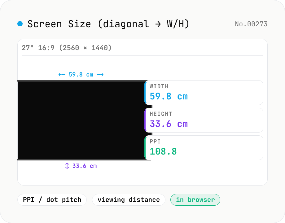
- Aspect ratio r = aw / ah (e.g. 16:9 → r = 1.778). Then `w = h·r` and `d² = w² + h² = h²·(r² + 1)`, so `h = d/√(r²+1)` and `w = h·r`. Multiply by 2.54 for cm. Example: 27" 16:9 → 23.5" × 13.2" (59.8 × 33.6 cm).
- PPI vs dot pitch?
- PPI (pixels per inch) is the pixel density; dot pitch is the physical size of one pixel in mm. They're reciprocals: dot pitch = 25.4 / PPI mm. A 27" 1440p (2560×1440) monitor lands at ≈108.8 PPI / 0.233 mm. Retina-class is around 220 PPI and up.
- What are the UHD / THX / SMPTE viewing distances?
- Three industry rules of thumb expressed as a multiple of screen width W: **UHD (4K)** = 0.75·W (closest you can sit and still benefit from 4K detail), **THX** = 1.2·W (cinema-style immersion), **SMPTE** = 1.6·W (classic HD reference). For a 65" 4K TV (W ≈ 144 cm), UHD ≈ 108 cm (1.1 m).
- Ultrawide vs standard at the same diagonal?
- A 34" 21:9 (UWQHD 3440×1440) is 79.4 cm wide × 34.0 cm tall — a 16:9 panel of the same diagonal would be ~75.3 × 42.3 cm. So you trade 8 cm of height for 4 cm of width. Plan for at least an 80 cm deep desk.
- What about phones (portrait orientation)?
- Use a portrait ratio like `9:16` or `9:19.5`. An iPhone 14 Pro at 6.1" with 9:19.5 lands around 14.4 × 6.6 cm at ~460 PPI. Phones typically run 200–500 PPI, well into the Retina range.
How to verify nothing is uploaded
This tool never sends your input outside your browser. The pages below explain how it works, how to audit it, and how the site is run.
Related tools
Unit Converter
Convert between length, weight, temperature, volume, area, speed, data size, and time units. Enter one value and see equivalents in every supported unit at once. Runs entirely in your browser — no uploads.
Image aspect-ratio finder — GCD ratios + 1080p / 4K / iPhone / TikTok match
Drop multiple images and see each one's width × height, the GCD-reduced aspect ratio (1920×1080 → 16:9, 3024×4032 → 3:4) and the closest matching standard format (Full HD 1080p, 4K UHD, iPhone screen sizes, TikTok 9:16, Instagram 4:5, YouTube thumbnail 1280×720 — 30+ presets). Useful for web design / marketing workflows: confirm a single asset fits Instagram + YouTube + TikTok, check whether a 21:9 hero shot matches your device targets, or sanity-check that an asset set is all the same aspect. The comparison table makes it easy to spot odd ones out. Everything runs in your browser (uses `Image()` `naturalWidth/Height`); images are never uploaded.
Paper Size Reference
Look up paper sizes (A4 / B5 / Letter / Legal / postcard / business card / envelopes) with millimetres, centimetres, inches, points, and pixel dimensions at 72 / 96 / 150 / 300 / 600 DPI. Distinguishes ISO 216 (A / B / C series) from JIS B; includes Japanese photo formats (L / 2L / KG) and postal envelope standards. Search across names, aliases, and notes with a series filter. Useful for print, DTP, PDF export, and image sizing decisions.
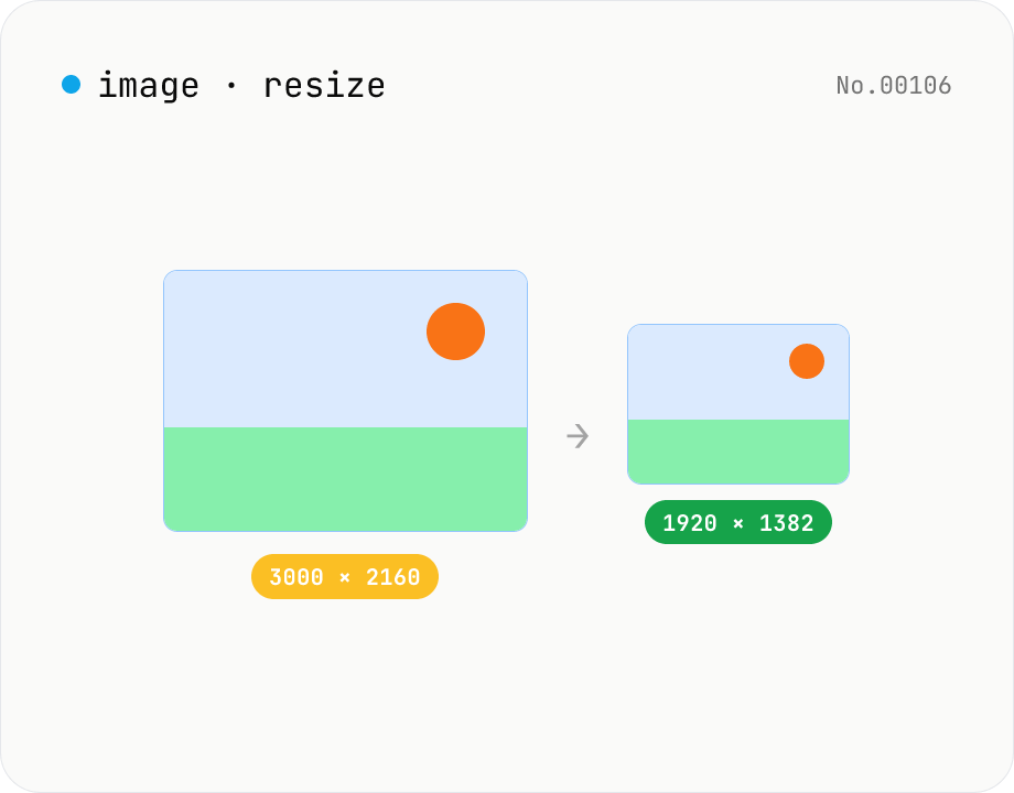
Image resize — by px or %, keep or lock aspect ratio
Resize JPEG / PNG / WebP images by specifying the longer side in pixels — aspect ratio is preserved. Batch process multiple files and download individually or as a ZIP. Runs entirely in your browser.