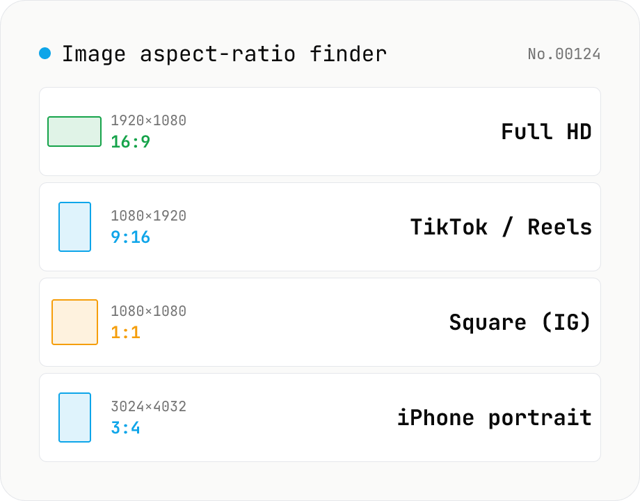
Image aspect-ratio finder — GCD ratios + 1080p / 4K / iPhone / TikTok match
Drop multiple images and see each one's width × height, the GCD-reduced aspect ratio (1920×1080 → 16:9, 3024×4032 → 3:4) and the closest matching standard format (Full HD 1080p, 4K UHD, iPhone screen sizes, TikTok 9:16, Instagram 4:5, YouTube thumbnail 1280×720 — 30+ presets). Useful for web design / marketing workflows: confirm a single asset fits Instagram + YouTube + TikTok, check whether a 21:9 hero shot matches your device targets, or sanity-check that an asset set is all the same aspect. The comparison table makes it easy to spot odd ones out. Everything runs in your browser (uses `Image()` `naturalWidth/Height`); images are never uploaded.
How to use
Drop image files (JPEG / PNG / WebP / GIF / SVG / HEIC / AVIF). Each image shows its width × height, GCD-reduced aspect ratio, and the closest standard format (1080p / 4K / iPhone / TikTok / Instagram, etc.). Toggle *Ignore orientation* to treat `16:9` and `9:16` as the same — handy when mixing portrait and landscape assets. Results can be copied as CSV or downloaded.
In depth
The images you inspect for aspect ratio are often unreleased assets
Aspect ratio checks happen right before publishing: preparing assets for a social post, aligning materials for a video project, verifying mockup dimensions. In each of those moments, the images being checked are often pre-release — product photos before launch, ad creatives pending approval, client-supplied assets, internal screenshots.
Uploading those files to an external service ‘just to check the ratio’ means the data reaches the operator’s server. The check is trivial; the data transfer isn’t.
Why uploading isn’t necessary for aspect-ratio lookup
Aspect ratio is arithmetic on pixel dimensions. The browser knows an image’s width and height the moment it decodes the file — no server processing required. Online ‘image info’ services that require uploads are upload-based by implementation choice, not technical necessity.
Even when the intent is ‘just checking,’ the data moves. Sending unreleased assets to a third-party server for a measurement that your browser can compute locally is an avoidable trade-off.
img.naturalWidth / naturalHeight — zero-byte analysis
The tool reads each file with FileReader, converts the binary to an ObjectURL, and sets it as the src of a hidden \<img> element. Once the browser’s image decoder fires the load event, naturalWidth and naturalHeight give the exact pixel dimensions. GCD reduction then produces the simplest integer ratio, and the result is compared against 30+ registered presets within a 1% decimal-ratio tolerance.
The pixel data is decoded into browser memory and goes no further. EXIF orientation correction is applied automatically in Chrome and Firefox. The ratio calculation, preset matching, and CSV generation all run in JavaScript. Open DevTools Network and process a batch — the log stays empty after initial page load.
Pre-share checks after confirming the ratio
Once you know the dimensions are right, a few more checks before sharing are worthwhile: strip EXIF / GPS with image-exif-strip or exif-gps-strip if the image came from a camera, blur faces or addresses with image-pixelate, and resize with image-resize if the pixel count exceeds the platform’s recommended maximum. Aspect ratio is the first stop; metadata and privacy checks are the next ones.
What naturalWidth / naturalHeight actually report — and EXIF Orientation gotchas
HTMLImageElement.naturalWidth and naturalHeight return the decoded pixel-buffer dimensions of an image. For JPEG, PNG, WebP, and AVIF, this is the raw pixel size recorded in the header. JPEGs additionally carry an EXIF Orientation tag (0x0112) describing how the pixel data was oriented when shot, encoded as one of eight values.
Chrome 81+, Firefox 77+, and Safari 13.1+ apply image-orientation: from-image by default in CSS. That means naturalWidth / naturalHeight return the orientation-corrected display dimensions. So a 4032 × 3024 pixel buffer with an Orientation of “rotate 90° right” is reported as naturalWidth = 3024 / naturalHeight = 4032. Older browsers and certain SVG / WebP renderers ignore Orientation, which can cause mismatches. This tool targets modern browser behaviour, so portrait-shot iPhone photos register correctly as 9:16 rather than 4:3.
Platform aspect-ratio guides at a glance
A round-up of major platforms: Instagram feed posts accept 1:1 square, 4:5 portrait (upper bound), or 1.91:1 landscape (upper bound). Instagram Stories and Reels use 9:16 (1080 × 1920 px recommended). TikTok is 9:16 (1080 × 1920 px). YouTube Shorts is 9:16 (1080 × 1920 px). X (Twitter) timeline posts recommend 16:9 (1200 × 675 px) but also accept 2:1. YouTube thumbnails are 16:9 at 1280 × 720 px minimum.
Common gotchas: Instagram auto-crops portraits taller than 4:5. Reels / TikTok at non-9:16 ratios (e.g. square) display with black bars or background blur, shrinking the active area and hurting retention metrics. For e-commerce, Amazon requires 1:1 (square, minimum 1000 × 1000 px), Shopify recommends 1:1 but allows 4:5, and Rakuten varies by merchant. This tool’s preset matcher includes both classical ratios (16:9, 4:3, 3:2) and platform-specific presets, so you can tell at a glance which destination an image fits best. For images whose aspect doesn’t match the destination, image-crop lets you cut to a target ratio explicitly instead of letting the platform auto-trim the frame.
FAQ
- What is a GCD aspect ratio?
- Width and height divided by their greatest common divisor. 1920×1080 → GCD(1920, 1080) = 120 → 16:9. 3024×4032 → GCD = 1008 → 3:4. It gives you the simplest integer form of the ratio.
- How is the closest preset chosen?
- We compare the decimal ratio against 30+ registered presets (1080p / 4K / iPhone / TikTok / Instagram / YouTube / print paper sizes, etc.). Anything within 1% of the decimal ratio is reported as the closest match.
- What happens if no preset matches?
- You get a category name like `Custom (close to 16:9)` with the relative distance (%) shown. This makes it easy to spot images that are *almost* a standard size but slightly off.
- Do SVG / HEIC work?
- Both yes (we use the `<img>` `naturalWidth/Height` route). If your browser can't decode HEIC, run it through `heic-convert` first. SVG returns the `viewBox` size.
- Why ignore orientation by default? No — it's opt-in.
- Instagram, etc. distinguish portrait vs landscape, so by default we keep them separate. Toggle the option to collapse them.
- What about EXIF Orientation 90° rotation?
- We use `<img>` `naturalWidth/Height`, which respects EXIF Orientation on modern Chrome / Firefox / Safari. For the raw pixel dimensions, use `image-info` instead.
- Is anything uploaded?
- No. We only use the `<img>` load event to read dimensions.
How to verify nothing is uploaded
This tool never sends your input outside your browser. The pages below explain how it works, how to audit it, and how the site is run.
Related tools
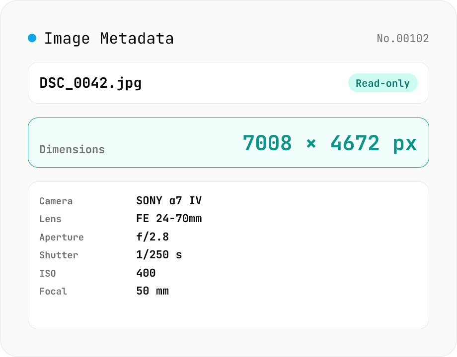
Image Metadata Viewer
Drop an image (JPEG / PNG / WebP / GIF / TIFF / HEIC / AVIF) to see its dimensions, file size, MIME type, aspect ratio, bit depth, color type, and DPI, plus extracted EXIF (capture time, camera make / model, lens, aperture, shutter speed, ISO, focal length, exposure compensation, orientation), GPS coordinates, ICC color profile, IPTC, and XMP. PNG headers (IHDR / pHYs) and JPEG markers (SOF / JFIF) are read by a small built-in parser; EXIF is parsed with exifr (MIT). Read-only — nothing is modified and the image never leaves your browser.
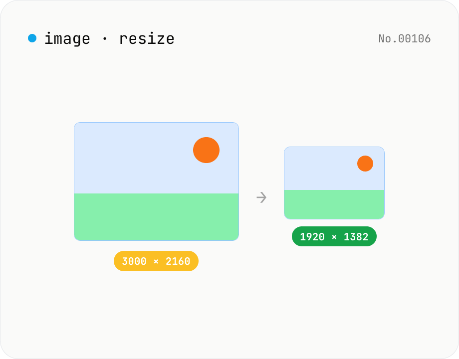
Image resize — by px or %, keep or lock aspect ratio
Resize JPEG / PNG / WebP images by specifying the longer side in pixels — aspect ratio is preserved. Batch process multiple files and download individually or as a ZIP. Runs entirely in your browser.
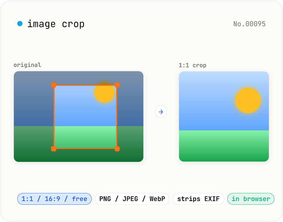
Image crop — drag to trim with free ratio or pixel size
Crop JPEG / PNG / WebP images by dragging directly on the preview. Pick an aspect ratio (free / 1:1 / 16:9 / 4:3 / 3:4 / 9:16) and an output format (PNG / JPEG / WebP) with quality control for the lossy formats. Your image never leaves the browser — every step runs locally.
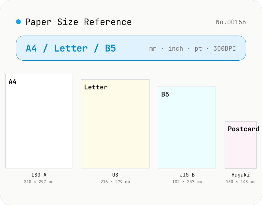
Paper Size Reference
Look up paper sizes (A4 / B5 / Letter / Legal / postcard / business card / envelopes) with millimetres, centimetres, inches, points, and pixel dimensions at 72 / 96 / 150 / 300 / 600 DPI. Distinguishes ISO 216 (A / B / C series) from JIS B; includes Japanese photo formats (L / 2L / KG) and postal envelope standards. Search across names, aliases, and notes with a series filter. Useful for print, DTP, PDF export, and image sizing decisions.