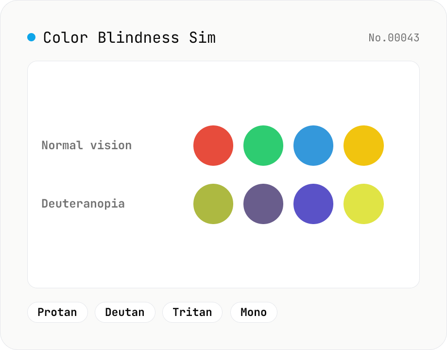
Color Blindness Simulator
Simulate how an image looks under protanopia (red-blind), deuteranopia (green-blind), tritanopia (blue-blind), or achromatopsia. Check whether your design or chart is color-accessible. Runs in the browser with Canvas and transform matrices — your image is never uploaded.
How to use
Pick a vision type (protanopia / deuteranopia / tritanopia / achromatopsia), drop or choose an image, then click Simulate. The original and the simulated result are shown side by side, and you can download as PNG / JPEG / WebP. It's handy for checking whether the colors in a design, chart, or transit map are accessible. Everything runs in the browser with Canvas and transform matrices — your image is never uploaded.
FAQ
- Is my image uploaded to a server?
- No. Loading, conversion, and download all happen in your browser. The image never leaves your device.
- Which vision types are supported?
- Four: protanopia (red), deuteranopia (green), tritanopia (blue), and achromatopsia (total color blindness). Deuteranopia and protanopia are the more common types.
- How accurate is the simulation?
- It's an approximation using widely-used color-blindness transform matrices. Real perception varies between individuals and by severity (dichromacy vs. anomalous trichromacy). Treat it as a guide for checking color choices; review by people with color vision deficiency is still valuable.
- Any tips for color-accessible design?
- Don't rely on color alone — combine it with brightness contrast, patterns, labels, and shapes. Red/green pairs are especially hard for protanopia and deuteranopia, so checking the contrast ratio (color-contrast-checker) alongside helps.
- What images can I use?
- A single JPEG / PNG / WebP image. It's most useful for images that convey meaning through color: charts, legends, transit maps, UI screenshots, and logos.
Related tools
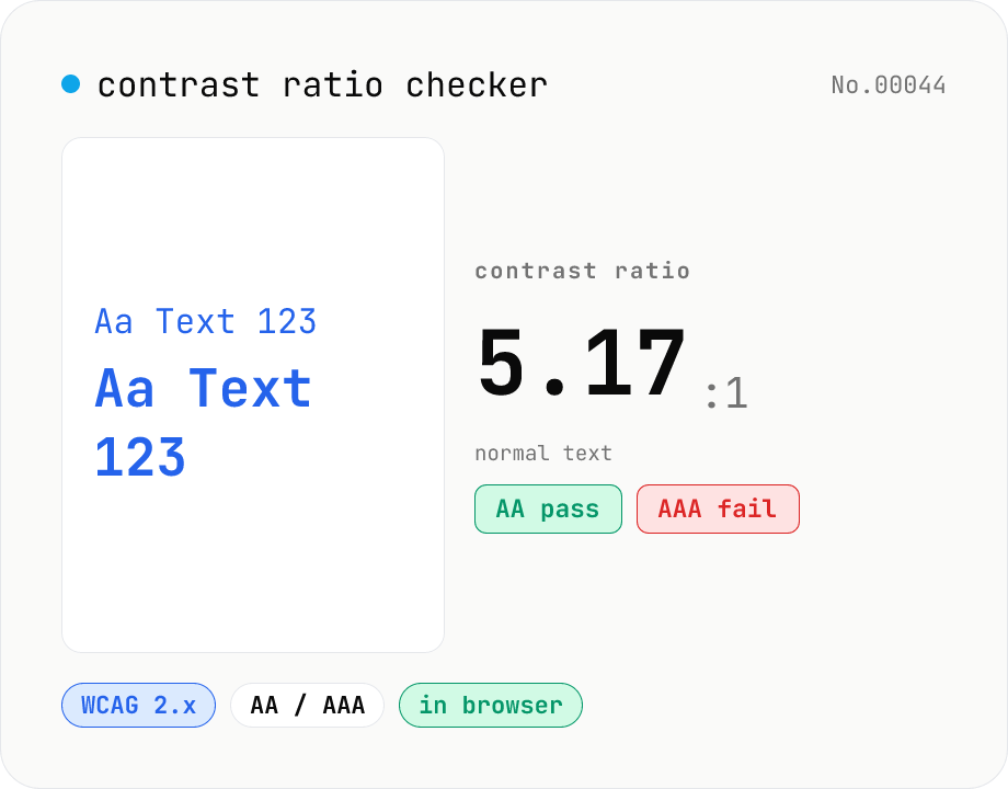
Contrast ratio checker — WCAG AA / AAA
Pick a foreground (text) and background color to compute the WCAG 2.x contrast ratio and instantly see whether it passes AA / AAA for normal text, large text, and UI components. Accepts HEX and rgb(), with a color picker and live preview. Everything runs in your browser — your colors never leave the page.
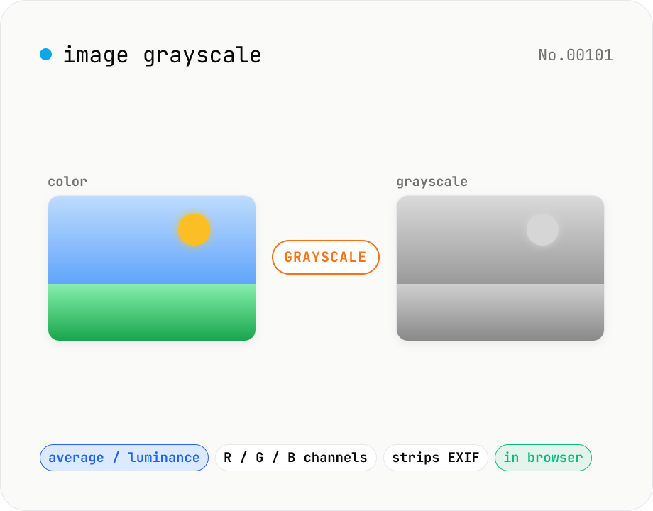
Image grayscale — 5 methods (average / BT.601 / R / G / B)
Convert JPEG / PNG / WebP images to grayscale inside your browser. Pick from five methods: average, luminance (BT.601), or any single channel (red / green / blue). Choose the output format (PNG / JPEG / WebP) and tweak the quality for the lossy formats. Your image is processed via canvas locally — nothing is uploaded.
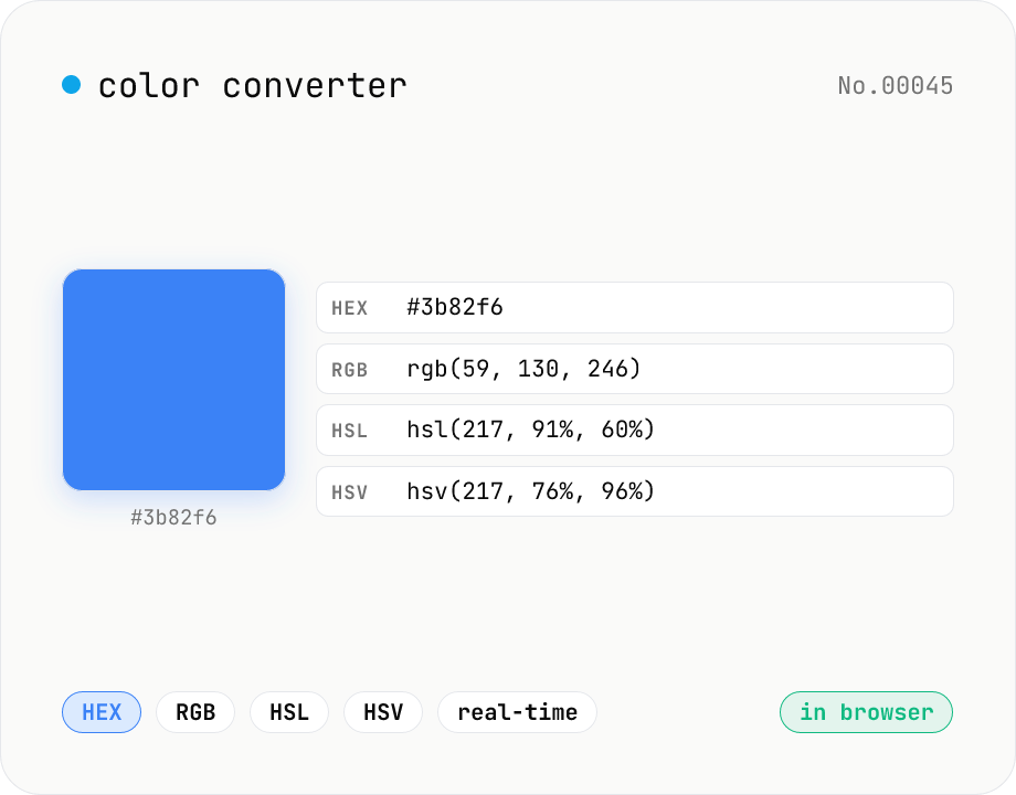
Color converter — HEX / RGB / HSL / HSV
Convert colors between HEX, RGB, HSL, and HSV in real time with a built-in color picker. Edit any field and the other three update instantly. Runs entirely in your browser — your color values never leave the page.
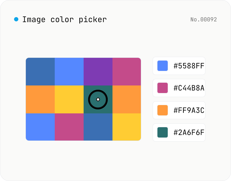
Image color picker — read pixel HEX / RGB / HSL values
Upload a JPEG / PNG / WebP and click any pixel to read its color as HEX / RGB / HSL. Hover to inspect the value with a magnifier loupe, then click to add it to a history list. Copy any format with a single click. Your image never leaves the browser — everything runs locally.