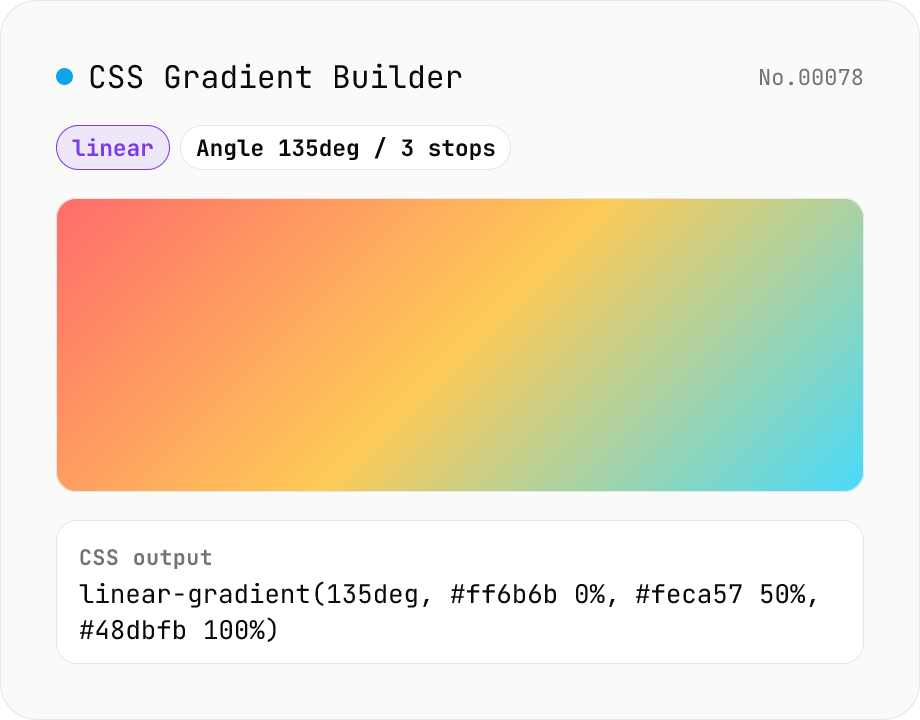
CSS Gradient Builder (linear / radial / conic)
Build CSS linear-gradient / radial-gradient / conic-gradient in the browser with a Mode-first picker. Add or remove color stops with live preview, tweak angle (linear / conic), shape and extent (radial), and center position (radial / conic). Copy as a full `background: …` declaration or just the value — both work straight into Tailwind arbitrary values like `bg-[linear-gradient(...)]`. Everything renders client-side; nothing is uploaded.
How to use
1) Pick the gradient type with the radio (linear / radial / conic) — switching type resets stops and parameters. 2) Add or remove color stops; each has a color picker and a position (0–100%). 3) Tweak the angle for linear, shape / extent / centre for radial, or start angle / centre for conic. 4) The preview updates live; copy the CSS at the bottom. 5) Use the toggle to include or omit the `background:` declaration.
FAQ
- Why does the type selector reset everything?
- Each type uses different parameters (linear = angle, radial = shape + extent + centre, conic = start angle + centre), and the most useful sample looks different too. Mode-first lets you pick the type and start with a sensible preset.
- Are color stops sorted automatically?
- No. The CSS gradient spec respects the explicit %, and your input order becomes the colour order. Crossing positions on purpose creates a hard-stop. Adjust manually if you want a strictly sorted list.
- What do the radial extent keywords do?
- They decide where the gradient ends. `farthest-corner` (default) reaches the most distant corner; `farthest-side` reaches the most distant edge; `closest-side` / `closest-corner` reach the nearest edge or corner. Pick the one that matches the element's aspect ratio.
- Browser support for conic-gradient?
- Chrome 69+, Safari 12.1+, Firefox 83+, Edge 79+ — every evergreen browser since 2020. IE never shipped it and no practical polyfill exists; consider SVG if you must support legacy.
- How do I use this with Tailwind CSS?
- Copy the value-only output into an arbitrary-value class, e.g. `<div class="bg-[radial-gradient(circle_at_30%_30%,#ffeaa7_0%,#fab1a0_50%,#a29bfe_100%)]">`. Tailwind requires underscores instead of spaces inside arbitrary values.
- Is my input uploaded?
- No. Colours, parameters and preview all stay in your browser.
Related tools
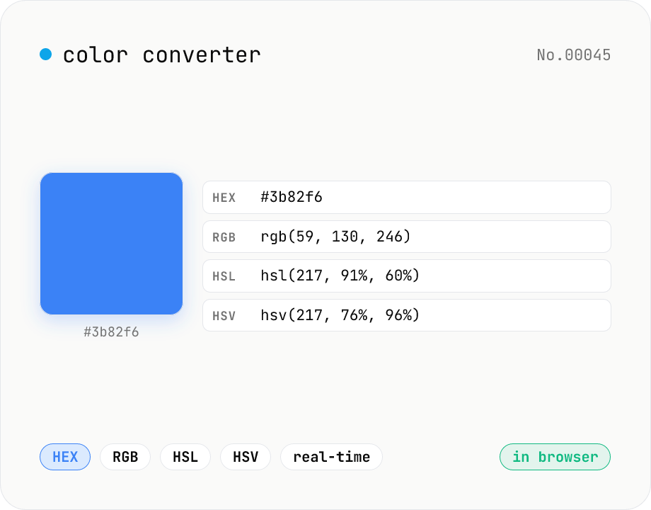
Color converter — HEX / RGB / HSL / HSV
Convert colors between HEX, RGB, HSL, and HSV in real time with a built-in color picker. Edit any field and the other three update instantly. Runs entirely in your browser — your color values never leave the page.
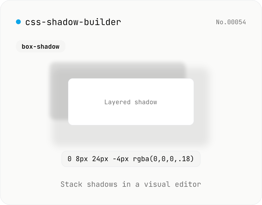
CSS shadow builder — visual GUI for box-shadow / text-shadow
Build CSS box-shadow and text-shadow visually. Toggle box / text mode and tune offset-x, offset-y, blur, spread (box only), color, and inset (box only) with sliders and number inputs. Stack multiple shadows for layered Material-style elevation, Neumorphism, text outlines, neon glows, and retro overlap — 9 presets to start. Live preview on a real div or real heading, plus a one-click copy as raw value or full CSS declaration. Pair with gradient-css for the full CSS-style trio. Runs entirely in your browser.
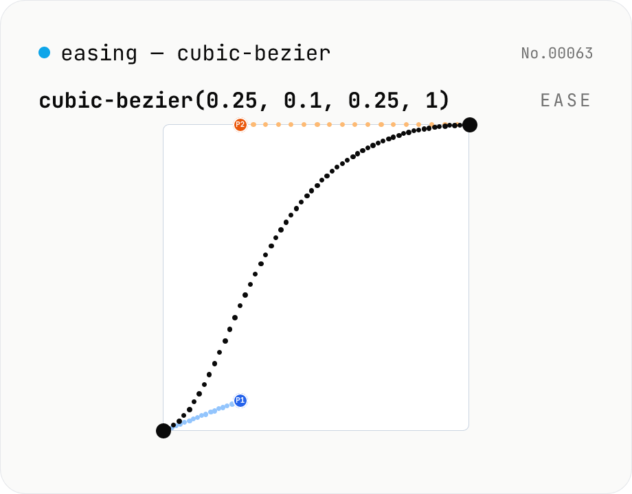
CSS easing builder — edit cubic-bezier(x1, y1, x2, y2) visually
Build cubic-bezier() timing functions for CSS transitions and animations with three synced views: an SVG preview curve with draggable control points, a numeric slider/input pair per coordinate, and a one-click library of presets (ease / ease-in / ease-out / ease-in-out, Material-style cubics, back/overshoot). A live motion preview (a bar that travels end-to-end) shows the actual feel. Output is the cubic-bezier(...) value or a ready-to-paste transition-timing-function declaration. Runs entirely in your browser.
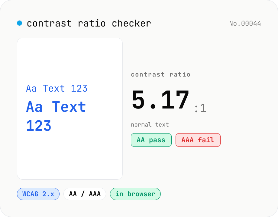
Contrast ratio checker — WCAG AA / AAA
Pick a foreground (text) and background color to compute the WCAG 2.x contrast ratio and instantly see whether it passes AA / AAA for normal text, large text, and UI components. Accepts HEX and rgb(), with a color picker and live preview. Everything runs in your browser — your colors never leave the page.