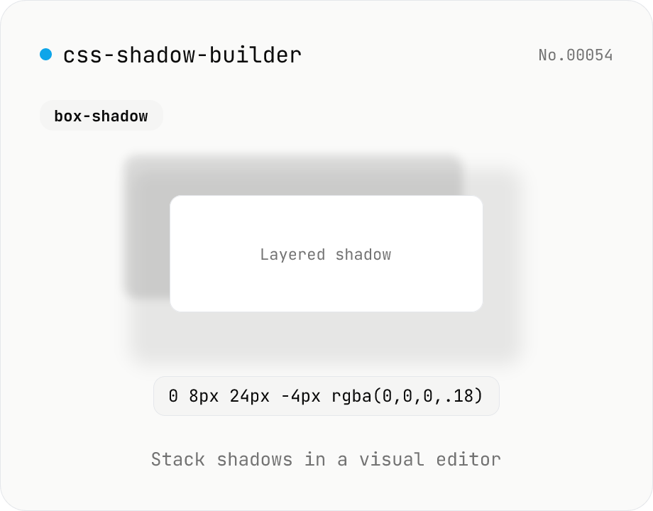
CSS shadow builder — visual GUI for box-shadow / text-shadow
Build CSS box-shadow and text-shadow visually. Toggle box / text mode and tune offset-x, offset-y, blur, spread (box only), color, and inset (box only) with sliders and number inputs. Stack multiple shadows for layered Material-style elevation, Neumorphism, text outlines, neon glows, and retro overlap — 9 presets to start. Live preview on a real div or real heading, plus a one-click copy as raw value or full CSS declaration. Pair with gradient-css for the full CSS-style trio. Runs entirely in your browser.
How to use
Pick box-shadow or text-shadow, then either start from a preset or click 『Add shadow』 and build layer by layer. Each shadow has X / Y offset, blur, spread (box only), color, and inset (box only) — adjust with sliders or number inputs. Stack two or three layers for Material Design elevation, Neumorphism, text outlines, neon glow, or retro overlap. The preview renders on a real div / real heading, and the CSS value copies in one click (raw value or full declaration).
FAQ
- Why stack multiple shadows?
- Real-world light is multi-source — a sharp contact shadow plus a softer ambient halo. CSS does the same: layering two or three shadows with different blur radii produces Material elevation, depth, and realism. The 『Card』 and 『Elevated』 presets use two layers; Neumorphism uses light-dark pairs.
- Why no spread or inset on text-shadow?
- CSS only allows `<offset-x> <offset-y> <blur-radius> <color>` for text-shadow. Spread and inset are box-shadow-only — those inputs auto-hide when you switch to text mode.
- Should I use rgba() for transparency?
- Yes — natural shadows are usually 5–30% opaque. The color picker returns #RRGGBB but you can type `rgba(0, 0, 0, 0.18)` directly into the text input. All presets ship as rgba.
- Can I use the output with Tailwind?
- Yes — paste the raw value into `shadow-[<value>]` (replace spaces with underscores per Tailwind's arbitrary-value syntax).
- Will the live preview match production?
- Rendering differs between browsers at the subpixel level (antialiasing), but the CSS values are identical. If Safari / Chrome / Firefox look slightly off, nudge spread or blur by a px.
Related tools
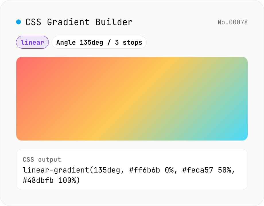
CSS Gradient Builder (linear / radial / conic)
Build CSS linear-gradient / radial-gradient / conic-gradient in the browser with a Mode-first picker. Add or remove color stops with live preview, tweak angle (linear / conic), shape and extent (radial), and center position (radial / conic). Copy as a full `background: …` declaration or just the value — both work straight into Tailwind arbitrary values like `bg-[linear-gradient(...)]`. Everything renders client-side; nothing is uploaded.
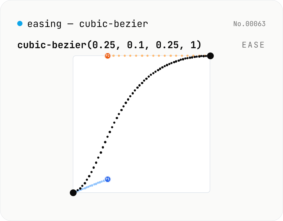
CSS easing builder — edit cubic-bezier(x1, y1, x2, y2) visually
Build cubic-bezier() timing functions for CSS transitions and animations with three synced views: an SVG preview curve with draggable control points, a numeric slider/input pair per coordinate, and a one-click library of presets (ease / ease-in / ease-out / ease-in-out, Material-style cubics, back/overshoot). A live motion preview (a bar that travels end-to-end) shows the actual feel. Output is the cubic-bezier(...) value or a ready-to-paste transition-timing-function declaration. Runs entirely in your browser.
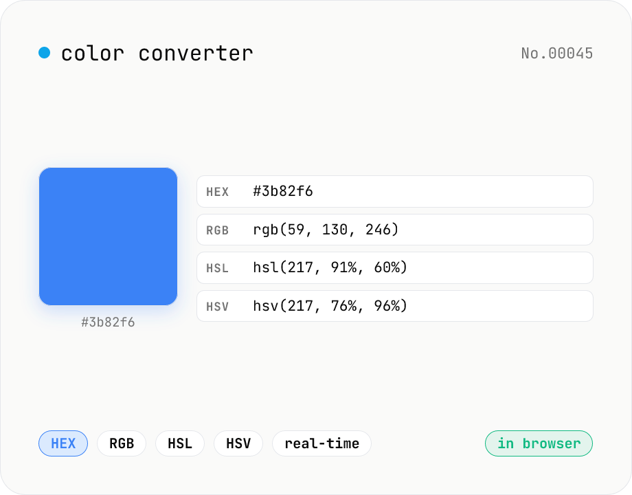
Color converter — HEX / RGB / HSL / HSV
Convert colors between HEX, RGB, HSL, and HSV in real time with a built-in color picker. Edit any field and the other three update instantly. Runs entirely in your browser — your color values never leave the page.
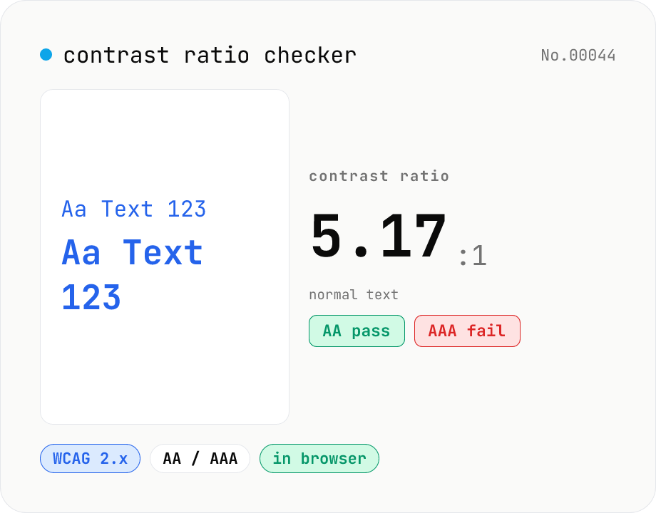
Contrast ratio checker — WCAG AA / AAA
Pick a foreground (text) and background color to compute the WCAG 2.x contrast ratio and instantly see whether it passes AA / AAA for normal text, large text, and UI components. Accepts HEX and rgb(), with a color picker and live preview. Everything runs in your browser — your colors never leave the page.