CSS rem ↔ px ↔ em ↔ pt ↔ % converter (variable base size)
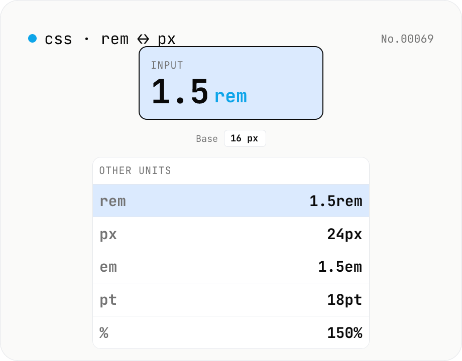
Convert CSS font-size units in all directions at once. Type **1.5rem** and see **24px / 1.5em / 18pt / 150%** instantly. The root font-size (default 16px) is adjustable via slider (10–32px) for Tailwind/Bootstrap (16px), Material (14sp), or custom design-system bases. A **common rem-value cheat sheet** (0.25–4) is shown alongside for quick reference. Useful when migrating between rem/px-based design tokens, building responsive type scales, or mapping Tailwind text-* utilities to actual pixels.
How to use
Enter a **value + unit** (e.g. `1.5rem`, `24px`, `0.875em`, `12pt`, `75%`) and you get all five units side by side. The **root font-size** (default 16px, the browser standard) is adjustable from 10–32px to match other design systems (Material Design uses 14sp on Android; a `62.5%` body lets `1rem = 10px`). The cheatsheet below lists 11 common rem values (0.25–4) with their px / em / pt counterparts — handy for cross-referencing Tailwind text-* utilities or migrating between rem and px tokens.
In depth
CSS unit conversion is pure arithmetic — no server ever needs to see it
rem, px, em, pt and % convert between each other using a fixed base font size (typically 16px) and two constants: 1pt = 96/72 px (from the CSS Values & Units specification) and 1em = 1rem = 1 × base. There is no data to fetch, no computation that requires a round trip — the answer to ‘what is 24px in rem?’ is 24 / 16 = 1.5rem, computable by a single division in the browser’s JavaScript engine.
Despite this, ‘CSS unit converter online’ is a populated search category, and the services that rank for it carry the usual payload of advertising and analytics SDKs. When the value you are converting is a design token from an unreleased product — the exact spacing scale, the typography ramp — those numbers are as sensitive as the design system they come from.
Design token values are specific design decisions
The most common reason to reach for a CSS unit converter is cross-referencing design specifications with code. A Figma spec says 24px; the stylesheet needs 1.5rem. Material Design’s body text is 14sp; the Tailwind config needs it in rem. A client delivers a brand stylesheet in px and the codebase is rem-first. In each case the values being converted are concrete numbers from an in-progress design system.
For projects building custom design systems, specifics like the chosen base size, the spacing scale intervals, and the typography step ratios are confidential design decisions. Running them through an online tool puts those specifics in a third-party access log.
Four arithmetic formulas, zero outgoing requests
This tool implements rem = px / base, em = px / base, pt = px * 0.75, % = em * 100 in browser JavaScript. Input is parsed with parseFloat, the unit is identified by a regex, the conversion formulas execute, and the result is formatted with toFixed. The base font-size slider triggers the same four calculations with the updated denominator. The rem cheatsheet values are computed once at startup.
Open DevTools Network and type a value: no requests appear. Move the base slider: still no requests. Everything stays in page memory.
Building accessibility-conscious rem-based layouts
Using rem instead of px for typography and spacing means that when a user increases their browser’s font size for readability or accessibility, the layout scales with them. The cheatsheet maps the 11 most common rem increments (0.25 through 4rem) to px, em, and pt at the current base — which is useful when migrating an existing px-based codebase to rem, or when cross-referencing Tailwind’s text-* scale. Changing the base slider to 14 or 10 shows how the conversions shift for non-standard base configurations.
Strict definitions and classic misconceptions about CSS units
CSS Values and Units Module Level 3 (W3C Recommendation) defines each unit precisely. px is technically an absolute unit, but its absolute size is not ‘one physical pixel’ — it is 1/96 inch viewed from a reference distance of 28 inches at 96 DPI (~0.26458mm). The definition is constructed so screen and print produce equivalent perceived sizes; it is unrelated to the device’s actual physical pixel count (Retina 2x / 3x pixels are denser than this reference but still report as the same number of CSS pixels). From there, 1pt = 1/72 inch, 1in = 96px, and therefore 1pt = 96/72 px ≈ 1.333px.
em and rem are relative units. em is a multiplier of the parent element’s font-size: in a .parent { font-size: 20px }, a child’s 1em is 20px. rem (root em) is the multiplier relative to <html>’s font-size, which is constant regardless of nesting. Browsers default to 16px for <html>, but a user who changes their browser font size to 18px shifts every rem value by 12.5%. Percentages depend on the property: font-size: 150% is 1.5× parent font size, but width: 50% is 50% of the containing block’s width. This tool’s rem ↔ px conversion assumes the standard <html> root model and does not simulate em cascade through nested elements.
Mobile, print, and high-DPI behaviour worth knowing
Mobile browsers (especially iOS Safari and Android Chrome) treat CSS pixels very differently depending on the viewport meta tag. Without <meta name="viewport" content="width=device-width, initial-scale=1">, an iOS device simulates a 980 CSS pixel width and shrinks the rendered page to fit the physical screen, which makes 16px text physically tiny. The rem-based approach combined with the standard viewport meta is the default for responsive design partly because it survives this scaling correctly.
Print media (@media print) operates at the printer’s DPI — typically 300 for office printers, 600–1200 for commercial — but CSS pixels still follow the 1in = 96px definition, so physical print sizes match the declared CSS units. pt is the more traditional print unit (10–12pt for body, 16–24pt for headings). On HiDPI / Retina displays the device has 2× or 3× the physical pixels per CSS pixel, but 1px in CSS still means one CSS pixel — the browser handles the upscaling. The one place this matters is hairline borders: border: 0.5px solid is meaningful on a Retina display but rounds to 1px on a standard display, which produces visible differences when designing thin separators. For non-typographic CSS lengths (inch, cm, mm, viewport units), unit-convert covers general distance conversion, and css-format is the natural next step when you want to re-format the file you’ve just edited.
FAQ
- Is my input uploaded?
- No — purely browser-side arithmetic, no external API.
- Why is pt = 4/3 px?
- **1pt = 1/72 inch** by definition (print standard). CSS defines **1 inch = 96 CSS pixels** in CSS Values & Units Level 4, so **1pt = 96/72 = 4/3 px ≈ 1.333 px**, and **1px = 0.75pt**. These are CSS reference pixels, not the device's physical pixels.
- rem vs em?
- **rem (root em)** is always relative to `<html>`'s font-size — globally fixed on the page. **em** is relative to the *parent* element's font-size and compounds when nested (parent 16px × `1.5em` × `0.8em` = 19.2px). This tool treats em and rem the same (base = root). Watch the difference in real nested DOM.
- Why default to 16px?
- Chrome / Firefox / Safari / Edge all default `<html>` to 16px, and Tailwind v4 uses `--font-size-base: 16px`. Users who scale up their browser font for accessibility shift this — which is why writing in rem (relative) is recommended over px (absolute).
- Tailwind text-* utilities at 16px?
- text-xs = 0.75rem (12px) / text-sm = 0.875rem (14px) / text-base = 1rem (16px) / text-lg = 1.125rem (18px) / text-xl = 1.25rem (20px) / text-2xl = 1.5rem (24px) / text-3xl = 1.875rem (30px) / text-4xl = 2.25rem (36px) / text-5xl = 3rem (48px). Change the base here and the px column updates everywhere.
- Why change the base?
- When the design system isn't centred on 16px. Material Design's body is 14sp. Some authors set `html { font-size: 62.5% }` so that `1rem = 10px` makes arithmetic trivial. Adjust the slider to match your codebase.
- What does `%` reference?
- `font-size: X%` is **a percentage of the parent's font-size**, so `100% = 1em` and `150% = 1.5em`. This tool treats `%` as `em × 100`.
- Are negative values allowed?
- Yes — you can enter `-0.5rem` or `-8px` (useful for margins, transforms). CSS itself rejects negative font-size, but the converter doesn't care about CSS validity.
- What about vw / vh / ch / ex?
- Not supported. **vw / vh** depend on runtime viewport size, **ch / ex** depend on the rendered font's metrics — none have a fixed pixel equivalent. A separate vw/vh tool would be the right home for those.
How to verify nothing is uploaded
This tool never sends your input outside your browser. The pages below explain how it works, how to audit it, and how the site is run.
Related tools
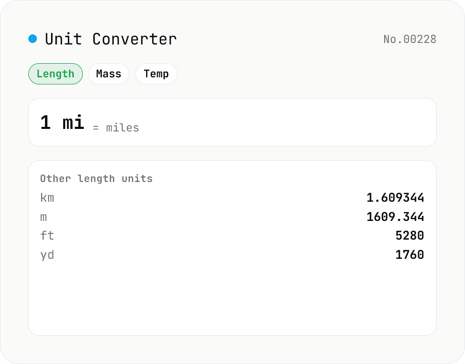
Unit Converter
Convert between length, weight, temperature, volume, area, speed, data size, and time units. Enter one value and see equivalents in every supported unit at once. Runs entirely in your browser — no uploads.
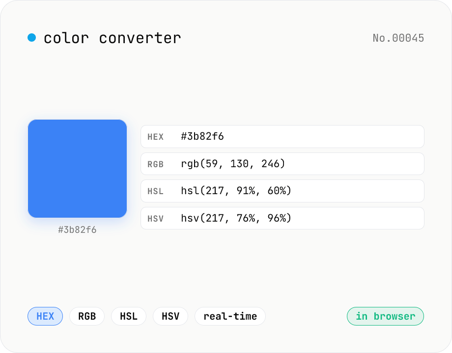
Color converter — HEX / RGB / HSL / HSV
Convert colors between HEX, RGB, HSL, and HSV in real time with a built-in color picker. Edit any field and the other three update instantly. Runs entirely in your browser — your color values never leave the page.
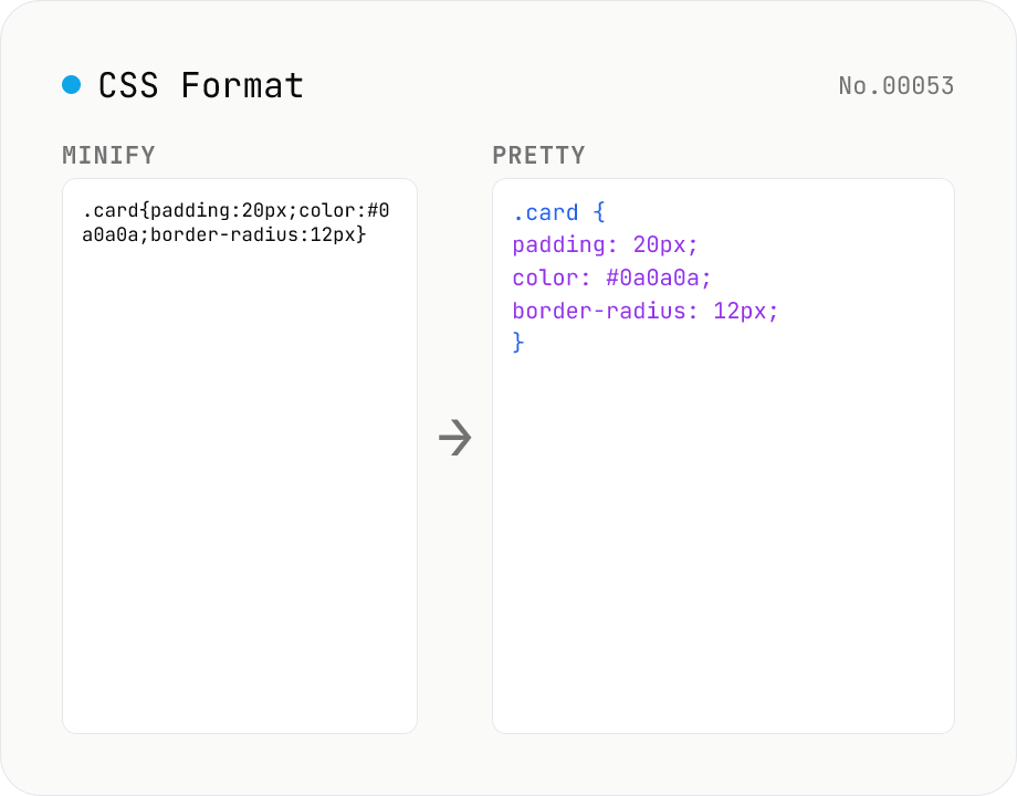
CSS Formatter — pretty / minify CSS in one click
Format CSS with two modes: pretty (indent 2/4/tabs, line breaks, one declaration per line) and minify (strip whitespace and line breaks). Built on css-tree (MIT) which parses any CSS into an AST and re-serializes it. Preserves @media / @supports / @keyframes / @font-face / @import at-rules, calc() / var() / custom properties (--var), vendor prefixes, and shorthands. Comments (`/* ... */`) are dropped by the css-tree parser. CSS-in-JS placeholders (`${expr}`) cannot be parsed — pass plain CSS only.
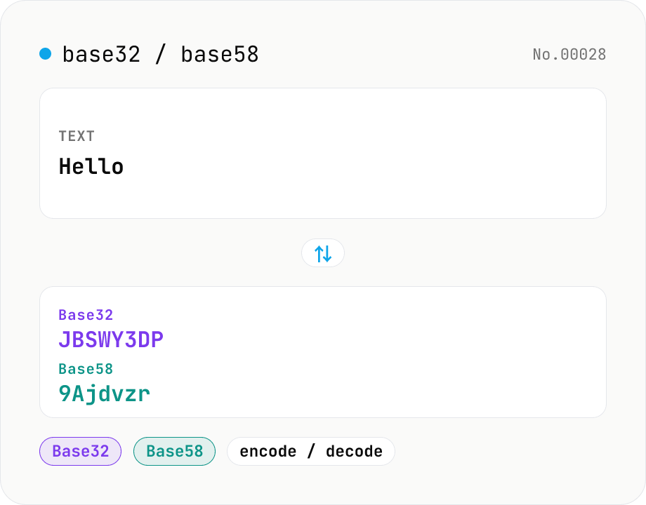
Base32 / Base58 encode & decode
Convert text to and from Base32 (RFC 4648 / TOTP 2FA secrets) and Base58 (Bitcoin addresses). Switch the variant (Base32 / Base58) and direction (encode / decode). UTF-8 byte based, so Japanese and emoji round-trip. Runs entirely in your browser.